ink review: rohrer and klingner scabiosa
We writers often struggle with the concept that our words might not survive us. Thousands of artists have produced countless poems and plays and prose over the years, of which but a few remain in the popular consciousness. What will remain of our words when we pass beyond the veil? A poem? A story? Will a collection of ink reviews define my literary existence for future generations?
Complicating our ennui is the medium that we choose. Writers of our era produce most of our words on a computer, which, when reduced to their base components are simply patterns encoded as zeroes and ones — ephemeral bits floating in a sea of magnetic media covered by a fog of electrons.
I’m not a luddite (precisely the opposite, in fact), but I think that the virtual nature of our work is why so many of us find comfort in writing with a fountain pen on good quality paper. There is a palpable sense of history in a pen and paper. Sure — paper can burn or moulder, but it is one of the few things that we as a society strive to preserve.
Writing with a physical instrument on a medium that’s been in use for thousands of years connects us to other writers, connects us to a history of the written word that will endure collectively, even when our individual contributions are forgotten. Our words have a physical presence in our notebooks that, depending upon the quality of the ink and paper, could outlast us.
The choice of ink, then, defines a lot about how you, as a writer, relate to the word on the page. For those of us that embrace impermanence, there are inks that will feather and run with the addition of the smallest amount of moisture, but for those that are caught in the grip of an existential crisis, there are permanent, waterproof inks — inks like iron gall.
For those unfamiliar with iron gall, it was the most common form of ink used in Europe from the 12th through the 19th centuries. When used on vellum or paper, it cannot be removed by rubbing or washing – only be scraping away a layer of the writing surface.
Traditional iron gall ink has one very specific caveat. It is produced by combining iron salts with tannic acid extracted from various vegetable sources (traditionally from oak galls, which are hard, brown spheres that grow on oak trees and house wasp larvae – for real – nature is weird), which means that it is not pH neutral. Over time, the acidic nature of the ink will gradually eat away at vellum and paper, and could contribute to the corrosion of any steel components on a fountain pen. Perhaps that feeling of permanence is illusory after all.
Fortunately, modern formulations of iron gall ink are safe for fountain pens. The levels of acid are low and should not be a cause for concern for most users. The main drawback to iron gall inks these days is the limited choice of color. Every iron gall ink I’ve seen has been a blue black — but then I was introduced to Rohrer and Klingner Scabiosa.
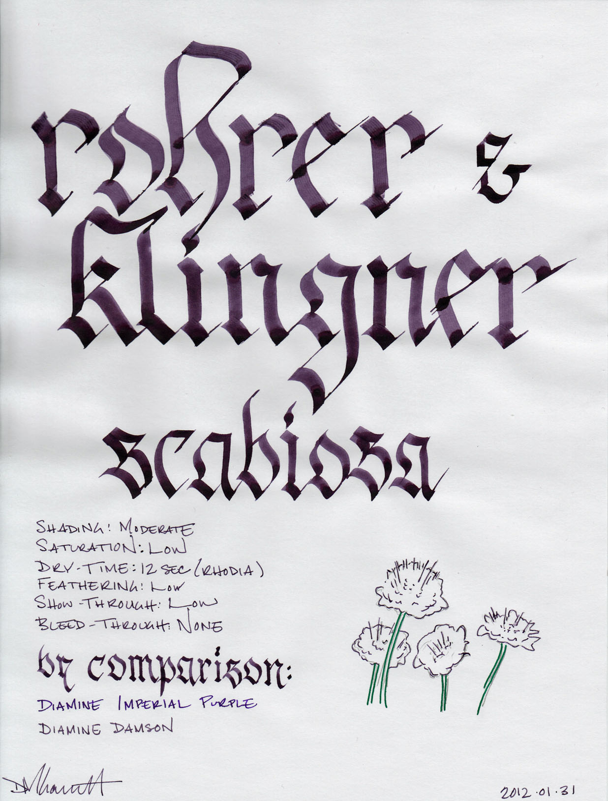
Scabiosa is a pretty, dusky purple comparable to Diamine Damson and J. Herbin Poussiere de Lune. Named after the eponymous flower, it has a low level of saturation which results in a moderate level of shading in a fine-nib pen. In a broad calligraphy pen, the shading is accentuated, and it results in a very lovely line full of depth and character.
Iron gall inks are traditionally dry-writing, and therefore behave well on most paper. Scabiosa is no exception. The show-through was minimal on all of the paper I tested, and I detected bleed-through only on the cheap copier paper that would let a pencil bleed-through.
Dry time was very good across the board, ranging from 3 seconds on the cheap copier paper to 12 seconds on the Rhodia paper. The outlier was staples bagasse, on which it took a full 16 seconds to dry. Feathering was also consistently low relative to the character of every paper; there were no surprises.
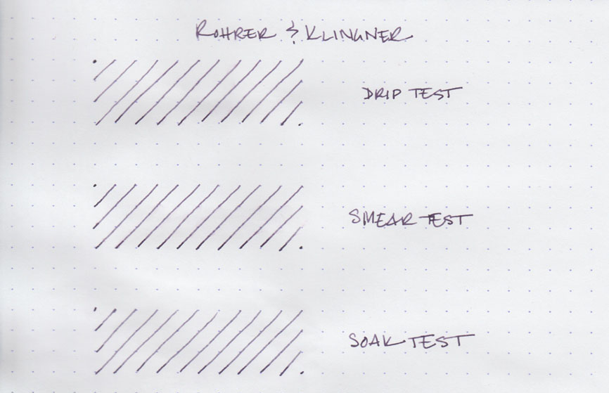
As an iron gall ink, Scabiosa has extraordinary water resistance. It’s almost not worth showing the results, as it is incredibly difficult to tell that I did any testing at all. However, for the sake of completeness, I’ve included it above.
The drip test, in which I let several drops of water sit on the page before blotting them up, shows no effect at all. While I was able to transfer a little bit of ink that hadn’t bonded to the writing paper on to the blotting paper, the line that remains is identical to the original.
For the smear test, in which I run a wet finger across the page, the results were almost the same. If you look very, very closely, you can see a very fine purple haze where the ink that hadn’t bonded to the Rhodia travelled across it.
Finally, the soak test, in which I run the paper under water for thirty seconds, resulted in a very gradual lightening of the lines, as all the ink that hadn’t bonded was washed away. What remains, though, is completely and easily readable.
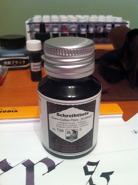
Rohrer and Klingner inks come in a 50ml glass bottle with a screw-on, metal lid. The color featured on the label in intended to mimic the color of the ink within. They’re neither unattractive nor exceptionally pretty; instead they’re merely functional, and remind me of art supplies. Unless you’re an artist, they’re not the kind of bottle you’re likely to feature in a prominent place on your desk.
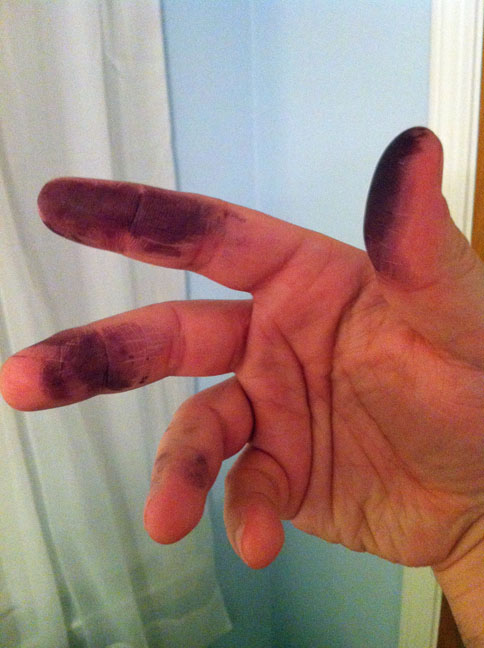
One final word about the water resistance of Scabiosa - it does a pretty good job of clinging to skin. This took a few washes to get completely off.
Rohrer and Klingner Scabiosa is a wonderful ink that I will not hesitate to recommend. It is the only purple iron-gall ink that I know of, it behaves admirably on all paper, and it is lovely to write with. If you like dusky purple inks like J.Herbin Poussiere de Lune or Diamine Damson, or you like your ink to have better staying power than the average ink, be sure to check out Scabiosa.
Review notes: The widest lines were made with two Pilot Parallel calligraphy pens: one with a steel 6.0mm nib and the other with a steel 3.8mm nib. The medium lines were made with a Lamy Joy Safari with a 1.9mm steel calligraphy nib. The narrow lines were created with a Visconti Homo Sapiens with an EF palladium nib. The paper is Rhodia 80 gsm from a Rhodia Bloc No. 18. The featured script is Fractur.